Quick Answer:
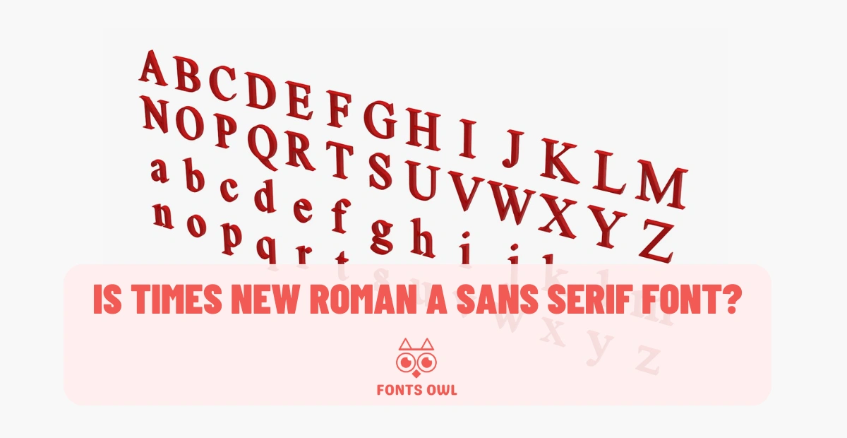
No, Times New Roman is not a sans-serif font. It is a serif font. Serif fonts have small lines or flourishes at the ends of their letters, while sans-serif fonts do not.
Have you ever stopped to consider the font style you’re using in your documents? Times New Roman has long been a staple in the world of typography, but is it really the best choice for every situation? In this blog post, we’ll explore the history and characteristics of Times New Roman, delve into the differences between serif and sans serif fonts, and discuss the advantages and disadvantages of this classic typeface.
By the end of this post, you’ll have a better understanding of why Times New Roman remains a popular choice and how to choose the right font for your needs, including answering the question: is Times New Roman a sans serif font?
Short Summary
Understanding Times New Roman
Times New Roman, a serif typeface, was commissioned for The Times newspaper in the 1930s to improve legibility in its printed editions. Designed by Stanley Morison in collaboration with Victor Lardent, this roman typeface was intended to be a more solid and resilient design, reverting to traditional printing practices from the eighteenth century and prior, which often featured thick and thin strokes. Over time, Times New Roman became a default font in many word processing software, such as Microsoft Word, further solidifying its status as a commonly used font.
This classic serif typeface has been used in various contexts, from newspapers and books to official documents. For example, the State Department used Times New Roman for a long time before making a switch to a different font, a move that can be referred to as the state department ditches times. The widespread use of Times New Roman began after its inclusion in the Microsoft suite in the early 90s, which also introduced popular sans serif fonts like Arial. As a result, Times New Roman has become synonymous with professionalism and authority, making it a go-to choice for many writers and designers.
However, relying solely on Times New Roman can be perceived as uninteresting, and it may impede the visual impact of your text, especially when compared to sans serif fonts. To maintain a fresh and engaging appearance, it’s essential to consider other font options and styles, which can enhance your text’s visuals and emphasize critical points.
Defining Serif and Sans Serif Fonts
Before diving into the debate about whether Times New Roman is a serif or sans serif font, it’s crucial to understand the difference between these two categories. Serif fonts employ small ornamental flourishes, known as serifs, to enhance characters and facilitate readability. These fonts are commonly used in printed materials like books and newspapers and often convey an authoritative, professional, and experienced feel.
On the other hand, sans serif fonts consist of unadorned lines, making them appear more modern and clean. Sans serif fonts are frequently used in digital formats, such as websites and presentations, where they convey a sense of cleanliness, minimalism, friendliness, or modernity.
To further clarify the distinction between serif and sans serif fonts, we’ll explore their unique characteristics and examples in the following subsections.
Serif Fonts
Serif fonts feature small decorative lines or flourishes at the ends of the strokes that compose the letters. These serifs serve to render letters distinct and more legible in printed materials such as books, newspapers, and magazines. Serif fonts often have a traditional and authoritative feel, making them a popular choice for professional and academic contexts.
Some of the more commonly used serif fonts include Times New Roman, Georgia, and Garamond. These fonts exhibit varying design characteristics, such as thick and thin strokes, which can drastically affect the overall appearance and readability of the text.
When considering a serif font for your project, it’s essential to evaluate the specific design features and how they align with the intended purpose and audience. For example, a serif font with generous spacing and easily distinguishable characters may be an ideal choice for body text in a book, while a more intricate and decorative serif font could be better suited for headlines or titles.
Sans Serif Fonts
Sans serif fonts, as the name suggests, lack the decorative strokes found in serif fonts. These sans serifs, often referred to as sans serif typefaces, are generally perceived as being more modern than their serif counterparts, often conveying a sense of cleanliness, minimalism, friendliness, or modernity. Due to their simplicity and clarity, sans serif fonts are frequently used in digital formats, such as websites and presentations, where they are easily readable on screens.
Calibri, Arial and Helvetica are popular sans serif fonts. They are widely used for both digital and print designs. These fonts have distinct design characteristics, such as straight lines and geometric shapes, which can contribute to a clean and modern appearance in your text.
When selecting a sans serif font for your project, consider how the font’s design features and overall aesthetic align with your brand’s character and the purpose of the text. For example, a sans serif font with a friendly and approachable appearance may be well-suited for a website targeting a younger audience, while a more minimalist and geometric sans serif font could effectively convey a sense of professionalism and sophistication.
Is Times New Roman a Sans Serif Font?
Now that we’ve explored the differences between serif and sans serif fonts, we can confidently answer the question. Is Times New Roman a sans serif font? The answer is no. Times New Roman is a serif typeface, as evident by the small decorative flourishes present at the ends of its strokes.
The confusion surrounding this topic likely stems from a lack of understanding regarding the definitions and characteristics of serif and sans serif fonts. With this clarification, we can continue to explore the advantages, disadvantages, and alternatives to Times New Roman in various contexts.
Advantages and Disadvantages of Times New Roman
One of the main advantages of using Times New Roman is its legibility, making it a suitable choice for body text in printed materials. However, relying exclusively on Times New Roman can be perceived as uninteresting and may limit the visual impact of your text. For example, using Times New Roman in a presentation can make your slides appear dull and potentially disengage your audience.
With these considerations in mind, it’s essential to weigh the pros and cons of using Times New Roman in different contexts. While it may be an appropriate choice for formal documents and academic papers, exploring alternative fonts can enhance the visual appeal and effectiveness of your text, particularly in digital formats and presentations.
Alternatives to Times New Roman
If you’re looking to break away from the traditional Times New Roman typeface, there are numerous alternative font styles available, both in the serif and sans serif categories. These alternative fonts can help make your work stand out, adhere to a specific purpose, and better engage your audience.
In the following subsections, we’ll provide examples of serif and sans serif alternatives to Times New Roman, along with brief descriptions of each.
Serif Alternatives
Several serif font alternatives to Times New Roman exist, such as Georgia, Garamond, and EB Garamond. These fonts exhibit varying design characteristics, which can significantly affect the overall appearance and readability of your text. For example, Georgia is known for its excellent readability on screens, while Garamond is a classic font that conveys a sense of elegance and sophistication.
In addition to these popular options, there are also several free alternatives to Times New Roman, including Libre Baskerville, Crimson Text, and Playfair Display. These fonts provide a fresh and unique look while maintaining the legibility and professional feel of serif fonts.
When considering a serif alternative to Times New Roman, it’s essential to evaluate the specific design features, such as the thickness of strokes and the presence of serifs, to ensure they align with the intended purpose and audience of your text.
Sans Serif Alternatives
For those looking to venture into the world of sans serif fonts, popular alternatives to Times New Roman include Futura, Lato, and Bebas Neue. Futura is a geometric font, known for its clean lines and modern appearance, while Lato features thin profiles and smooth curves, providing a sophisticated look and excellent readability. If you’re seeking a more casual option, you might consider Comic Sans, which is a widely recognized and often debated font in the design community.
Bebas Neue, on the other hand, is particularly advantageous when used in conjunction with text superimposed over an image. This font is best suited for title fonts or concise phrases, as opposed to larger passages of text.
As with serif alternatives, it’s crucial to consider the design characteristics and overall aesthetic of these sans-serif options to ensure they align with your brand’s character and the purpose of your text.
Tips for Choosing the Right Font
Selecting the right font for your project is a critical aspect of effective communication and design. When choosing the appropriate font, consider the purpose of the text and the audience it is intended for. Factors such as readability, aesthetics, and audience expectations should guide your decision-making process. Select typefaces with generous spacing, as they can improve readability and accessibility for your audience. Additionally, ensure that the font style aligns with your brand’s character and the overall tone of the text. For example, a formal and professional font may be more suitable for an academic paper, while a friendly and approachable font could better engage a younger audience.
Lastly, evaluate the readability and scalability of the font. This will help ensure that your text remains legible and visually appealing across various platforms and devices, ultimately contributing to a more effective and engaging communication.
Summary💭
In conclusion, Times New Roman is a classic serif typeface with a long history and widespread use in various contexts. While it offers excellent legibility, relying solely on this font can limit the visual impact of your text. By exploring alternatives in both serif and sans serif categories, and considering factors such as readability, aesthetics, and audience expectations, you can select the right font for your project and create a more engaging and visually appealing communication. So, the next time you start a new project, take a moment to consider your font choices and let your creativity and purpose guide you toward the perfect typeface.
Frequently Asked Questions
Answer: Times New Roman is a serif typeface developed by Stanley Morison for the British newspaper The Times in 1931. It has been widely used for decades, both in print and on digital platforms, due to its legibility and neat design.
The typeface is a classic choice for many publications, as it is easy to read and has a timeless look. It is also a popular choice for body text in books, magazines, and websites.
Answer: No, sans serif is not the same as Times New Roman. Times New Roman is a serif typeface and has small decorative flourishes on the ends of some strokes.
Sans serif does not have these details, and an example would be the Arial font.
Answer: Times New Roman is a Transitional serif typeface developed in 1931 by Stanley Morison and Victor Lardent for the British newspaper The Times. It is characterized by its crisp and legible appearance, with emphasis on economy, and was designed to meet the specific needs of newspapers typography.
Answer: Arial is a sans serif font, while Times New Roman is a serif font. Sans serif fonts have simpler lines and lack the small decorative marks of serif fonts, which are often used to make text easier to read.
Answer: Serif fonts include decorative strokes that give characters a more traditional feel, while sans serif fonts have simpler lines that create a modern and minimalist look.
Leave a Reply