SHARE ON SOCIAL MEDIA
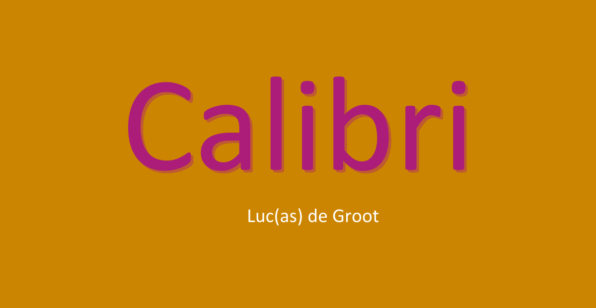
About Calibri Font
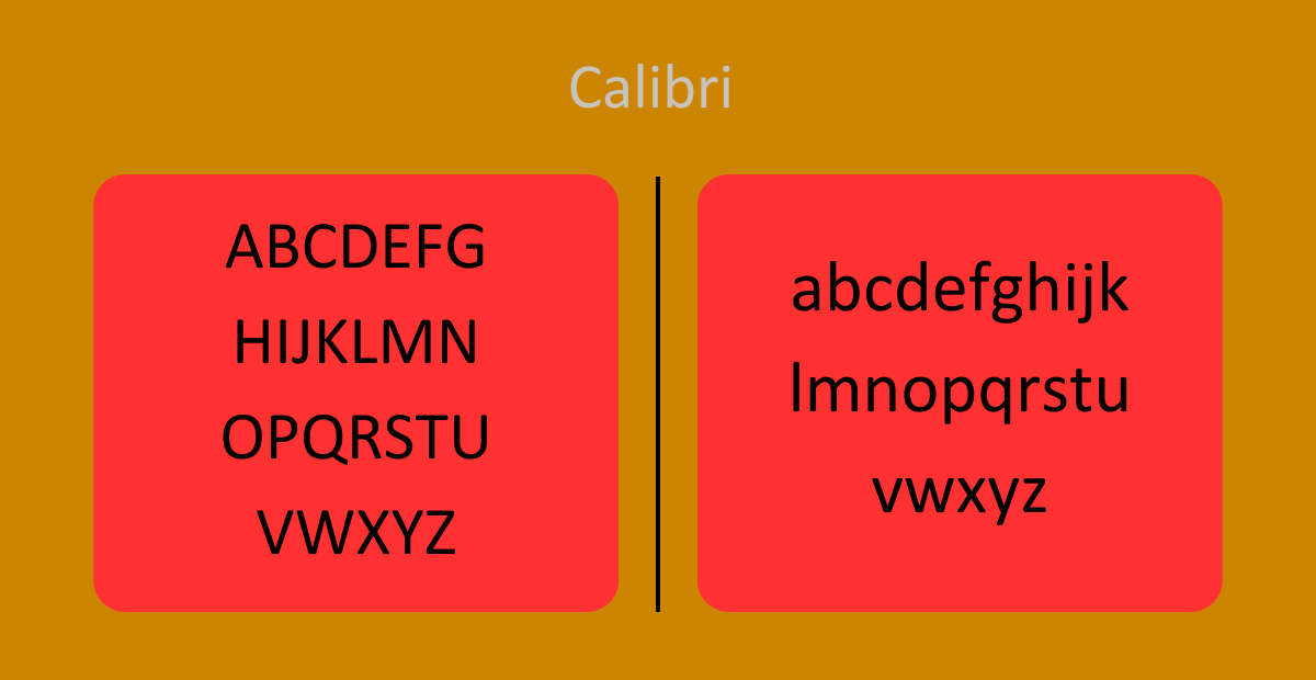
| Categories | Sans-Serif. |
| Designer | Luc (as) de Groot |
| License | Free For Personal Purposes. |
| File Type | OTF and TTF |
Calibri, pronounced as /kəˈliːbri/, is a popular digital sans-serif typeface known for its modern and humanist design. Font called “Calibri” was designed by Luc(as) de Groot and released to the public in 2007 with Microsoft Office 2007 and Windows Vista. Since then, Calibri has gained widespread recognition and is widely used in various applications, particularly in Microsoft Office software.
Here are some key features that make Calibri an appealing choice:
- ClearType Font Collection: Calibri is part of the ClearType Font Collection, a suite of fonts developed for Windows Vista. All fonts in this collection start with the letter “C” and were specifically designed to complement Microsoft’s ClearType text rendering system. This technology enhances text legibility on liquid-crystal display monitors, resulting in clearer and more readable text.
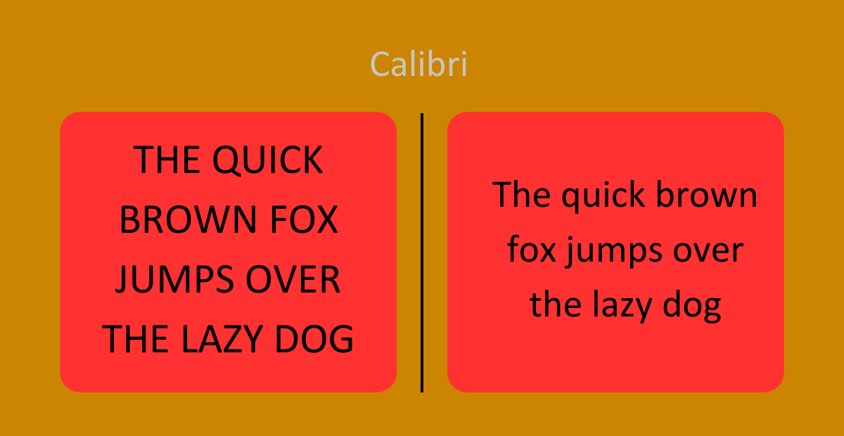
- Subtle Rounded Design: Calibri’s design is characterized by subtly rounded stems and corners, providing a soft and warm appearance. These rounded elements become more prominent when used at larger sizes, adding visual interest while maintaining legibility.
- True Italic Style: Calibri features a “true italic” style with influences from handwriting. This characteristic is commonly seen in modern sans-serif typefaces and adds a touch of elegance to the font. The italic form of Calibri is carefully crafted to ensure fluidity and readability, making it suitable for a wide range of applications.
- Default Typeface in Microsoft Office: With the release of Microsoft Office 2007, Calibri replaced Times New Roman as the default typeface in Word. It also became the default font in PowerPoint, Excel, Outlook, and WordPad, replacing Arial. Calibri was chosen for its readability on screen and its modern look, since more and more documents are being viewed digitally.
- Designed for Digital Display: Calibri was specifically designed to enhance legibility on digital devices. Its well-balanced proportions, open counters, and carefully crafted letterforms ensure clear and comfortable reading experiences on screens of all sizes. Whether you’re working on a computer monitor, tablet, or smartphone, Calibri delivers optimal readability.
- Luc(as) de Groot: The talented designer behind Calibri, Luc(as) de Groot, is renowned for his expertise in typography. His meticulous attention to detail and deep understanding of type design principles are evident in Calibri’s refined appearance and versatility. De Groot’s dedication to creating functional and aesthetically pleasing typefaces has contributed significantly to the success of Calibri.
- Licensing: Calibri is available as a free font for personal use. It can be freely installed and utilized for personal projects, such as creating documents, presentations, or designing personal websites. However, for commercial purposes, it’s important to review the licensing terms and ensure compliance with the appropriate license agreements.
Calibri’s modern and readable design, combined with its widespread availability, has made it a go-to choice for many users, particularly in the Microsoft ecosystem. Its subtle rounded features, true italic style, and focus on on-screen legibility make Calibri a versatile and reliable typeface suitable for various digital applications. Whether you’re creating professional documents or designing user interfaces, Calibri’s warm and inviting character is sure to enhance the overall visual experience.

Leave a Reply