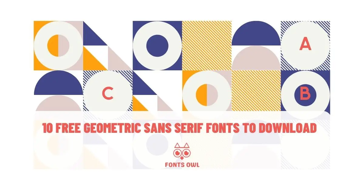
Typography plays a crucial role in the world of design, and one of the most versatile and popular styles is geometric sans-serif typefaces. With their clean lines, minimalist design, and reliance on basic geometric shapes, these fonts can elevate any project, be it print or digital. In this blog post, we’ll introduce you to the top 10 free geometric sans serif fonts to download in 2023, and provide helpful tips on choosing the right typeface for your needs. Get ready to discover a world of stunning typefaces that will make your designs stand out!
Short Summary:
- Geometric sans serif typefaces are a popular choice for modern design due to their versatility and reliance on basic geometric shapes.
- Careful consideration of font size, line spacing, letter spacing, contrast and whitespace is necessary when creating designs with these fonts.
- Geometric sans serif fonts can be effectively used in logo and poster design to create stunning visuals that communicate your brand identity.
Understanding Geometric Sans Serif Typefaces
Geometric sans serif typefaces are distinguished by the use of geometric shapes to craft the structure of the letters. This gives a stringent, objective and encompassing feel to each typeface. Their popularity stems from their versatility, simplicity, and reliance on basic geometric shapes.
From minimalist web design to modern branding, geometric sans serif fonts are a go-to choice for designers seeking a clean and contemporary aesthetic.
Basic Geometric Shapes in Typography
The fundamental geometric shapes used in typography are circle, square, and triangle. These shapes provide balance, structure, and visual interest to the design of geometric fonts.
Examples of basic geometric shapes in typography include circles, squares, triangles, rectangles, and ovals. As the building blocks of geometric typefaces, these shapes contribute to the modern and minimalist feel that makes these fonts so popular.
Geometric Forms and Sharp Corners
Geometric forms in typography refer to shapes and forms that are based on mathematical equations and geometric principles. They are often used to create a modern and clean aesthetic in a design. Sharp corners in geometric forms can contribute to this modern and contemporary look, as well as help establish balance and structure in a design.
Some of the fonts mentioned in this blog post, such as Flat Level, Metabola Sans, and Mustica PRO, showcase geometric forms and sharp corners in their design.
Top 10 Unique Geometric Sans Serif Fonts to Download
Now that we have a deeper understanding of geometric sans serif typefaces, let’s dive into our top 10 unique geometric sans serif fonts available for download in 2023. These fonts showcase a range of styles and features, making them perfect for various design projects.
From sleek display fonts like Flat Level to versatile typefaces like Aeternus, this list has something for everyone.
1. Flat Level Font
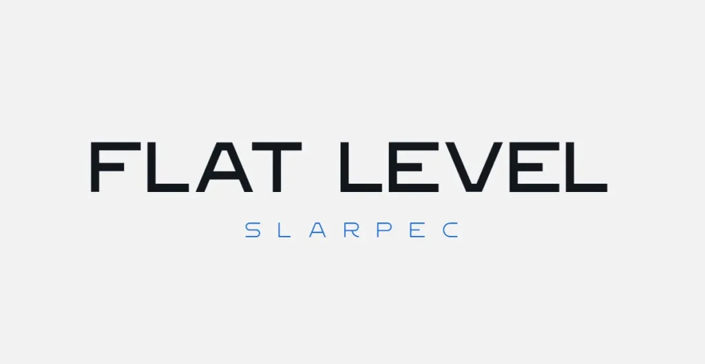
Flat Level is a unique, sharp sans serif display font featuring two weights and containing only all caps letters, numbers, and symbols. Its distinct design is characterized by its sharp edges and bold appearance, making it a great choice for eye-catching headlines or logos.
Flat Level offers two font weights: Regular and Bold, providing flexibility for various design applications.
2. Metabola Sans
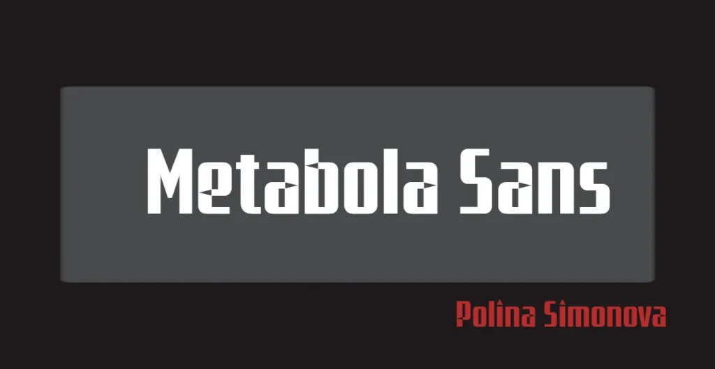
Metabola Sans is a modern geometric grotesque typeface featuring unique triangular accent shapes. Inspired by condensed grotesques of the mid to late 20th century, this font is both contemporary and visually interesting.
The unique triangular accent shapes give Metabola Sans a distinctive appearance, making it an excellent choice for projects that require a modern and memorable typeface.
3. Mustica Pro
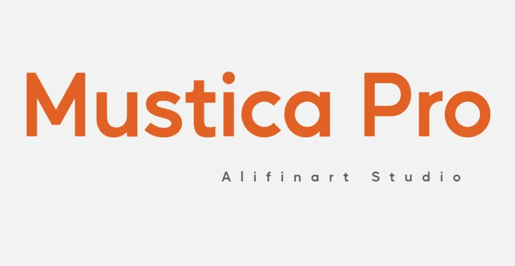
Mustica Pro is a highly precise sans serif font that offers extensive language support. With a range of OpenType features, this font is compatible with Latin, Cyrillic, and Greek languages, making it ideal for multilingual projects.
The clean design and precise letterforms make Mustica Pro a versatile option for a wide variety of design applications, from branding to web design.
4. Onest
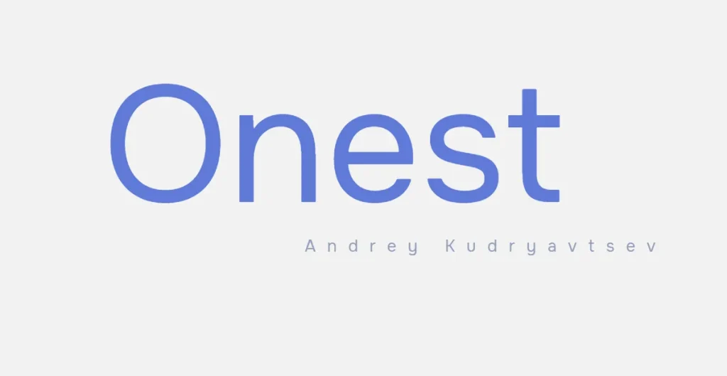
Onest is a unique combination of geometric and humanistic fonts, offering seven fonts that range from thin to extra bold. Its neutral graphemes are designed to promote honest communication, making it an ideal choice for projects that require clear and straightforward typography.
The fusion of geometric and humanistic grotesques gives rise to the fusion of geometric and humanistic grotesques. Onest a unique and versatile design that can be used in a variety of applications, from branding to editorial layouts.
5. Aeternus
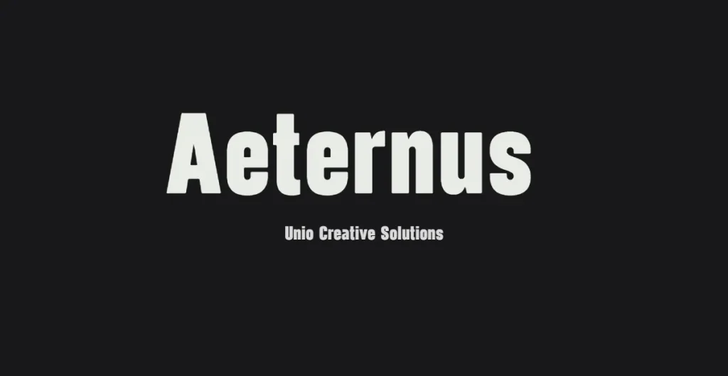
Aeternus is a modern geometric sans-serif typeface with accompanying italics. This versatile font offers a range of weights and heights, providing adaptability for any text application. With its clean lines and elegant design, Aeternus is suitable for a variety of projects, including headlines, logos, and body text.
The inclusion of italics adds an extra layer of flexibility, allowing you to create a dynamic and engaging design.
6. Burle Sans
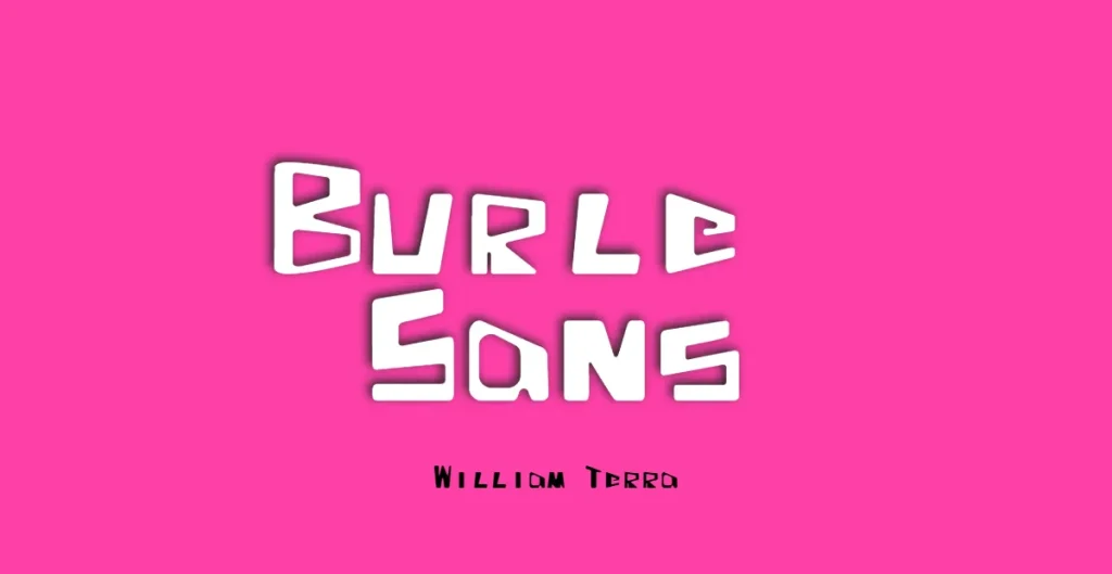
Burle Sans font is a geometric font inspired by the work of Brazilian landscape designer R. Burle Marx, providing a soft feeling due to its corners and shape. Its straight strokes and solid structure, however, lend it strength.
In addition to its unique design, the Burle Sans font also includes OpenType features such as proportional lining figures and tabular lining figures. This font is a contemporary and adaptable tribute to the work of R. Burle Marx, making it an excellent choice for projects that require a unique and distinctive typeface.
7. Bion
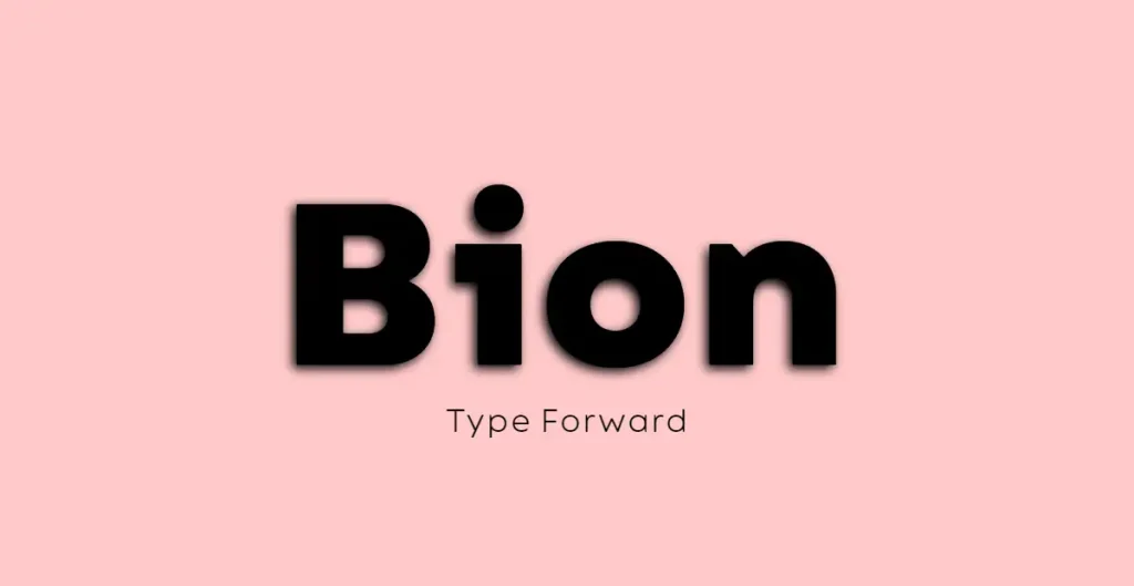
Bion is a modern geometric sans-serif typeface featuring 40 weights and OpenType features. With a high x-height, vertically cut terminals, and a range of weights from thin to extra bold, Bion offers a unique and versatile design.
The font is available in Upright, Italic, and Condensed variations, providing a wide range of options for creating distinct designs. Bion is an excellent choice for projects that require a balanced and contemporary typeface with plenty of options for customization.
8. Santello
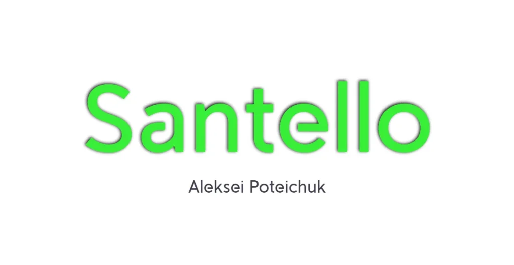
Santello is a modern geometric sans serif font that incorporates classic Futura and contemporary grotesque elements. This unique combination gives Santello a distinctive aesthetic, making it ideal for projects seeking a font that blends the best of both styles.
With its roots in classic Futura and influence from modern humanistic grotesque, Santello offers a fresh and versatile typeface perfect for a wide range of design applications.
9. Made Infinity
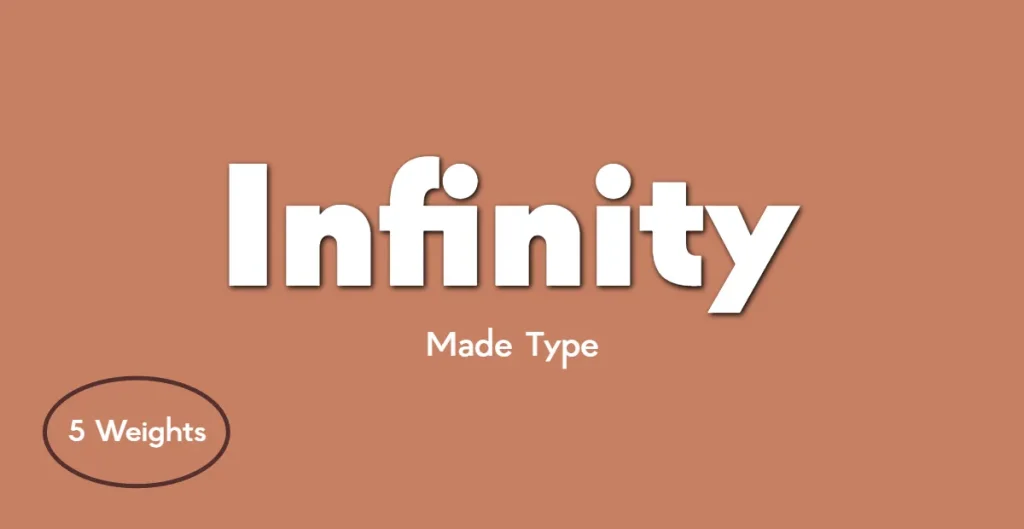
Made Infinity is a highly versatile display font that is ideal for graphic design, web design, signage, logos, and editorial design. Its modern and elegant design is constructed with a single style that encompasses capital letters, small letters, glyphs, and punctuations.
The clean lines and minimalist aesthetic of Made Infinity make it an excellent choice for projects requiring a versatile and visually appealing typeface.
10. ZT FlooGn
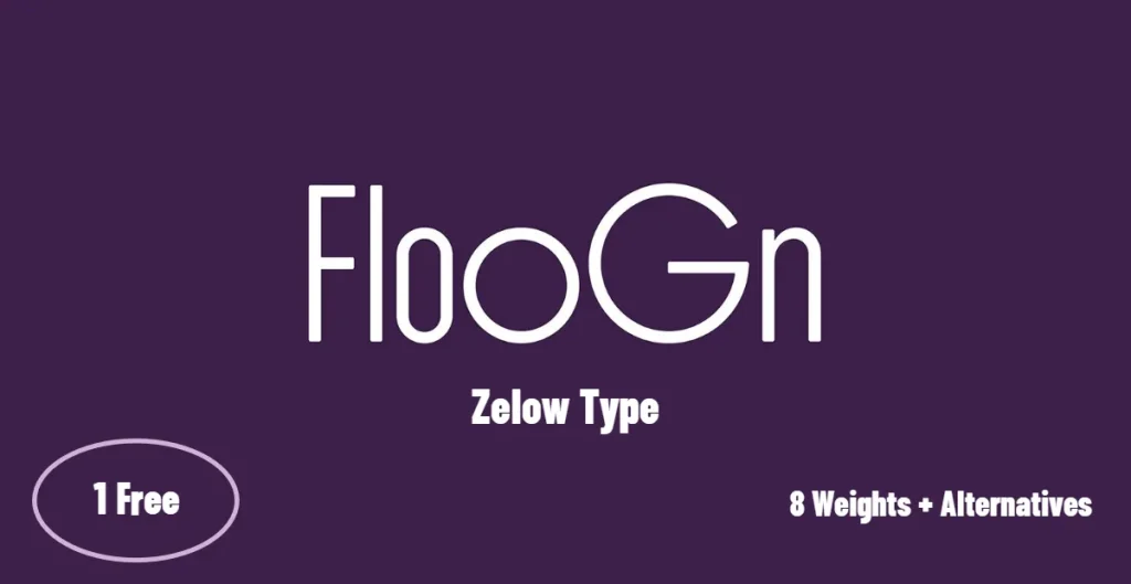
ZT FlooGn is a modern sans serif font featuring a high density design and distinctive alternatives. Its rounded aesthetic, balanced proportions, and uniform stroke width give the font a unique look.
In addition to its distinctive design, ZT FlooGn offers a variety of unique alternatives, including a wide range of weights, italics, and alternate characters. This contemporary font is perfect for projects that require a typeface with a bold and memorable design.
How to Choose the Right Geometric Typeface for Your Project
Selecting the right geometric typeface for your project can be a daunting task, given the plethora of options available. It’s essential to consider factors such as brand identity, the atmosphere of the project, functionality, versatility, message, legibility, and aesthetic.
In this section, we’ll provide you with guidance on how to balance geometry and readability, as well as tips for pairing geometric fonts with serif fonts.
Balancing Geometry and Readability
Achieving the perfect balance between geometry and readability in typography is crucial for creating a visually pleasing and legible design. Factors such as font size, line spacing, letter spacing, contrast, and the use of whitespace should be taken into consideration when trying to strike this balance.
It is also essential to select a typeface that is suitable for the purpose and intended audience, as this will ensure an optimal balance between geometry and readability. By carefully considering these factors, you can create a design that is both visually engaging and highly legible.
Pairing Geometric Fonts with Serif Fonts
Pairing geometric fonts with serif fonts can create a harmonious and visually appealing design that blends the modern, minimalistic look of geometric typefaces with the traditional, classic feel of serif fonts. To achieve this balance, it is important to consider the contrast between the two font styles, as well as the atmosphere and spirit of the project or website.
Transitional serifs, for example, pair well with geometric or rounded sans serifs. By carefully selecting complementary fonts and paying attention to the overall design, you can create a cohesive and visually appealing design that effectively communicates your message.
Using Geometric Sans Serif Fonts in Your Designs
In this section, we will explore two main applications of geometric sans serif fonts in design: logo and poster design. By understanding how to effectively use these typefaces in these specific contexts, you can create stunning and memorable visuals that will leave a lasting impression on your audience.
Logo Design with Geometric Typefaces
Incorporating geometric typefaces into logo design can result in a sleek and modern aesthetic. Pairing these fonts with complementary fonts, such as transitional serifs, can create a balanced and harmonious design.
Additionally, using clean lines and minimalist design can help create a logo that is both recognizable and memorable. By being mindful of the fonts used and their combination, you can create a logo design that effectively communicates your brand identity and captures the attention of your target audience.
Poster Design and Geometric Fonts
Geometric fonts can add a modern and clean aesthetic to poster design. When incorporating these typefaces into your design, it is essential to maintain a simple design and limit the fonts to no more than two font types. Additionally, consider the size, weight, and letter spacing of the font to ensure a balanced and visually appealing design.
By following these guidelines, you can create a poster design that effectively communicates your message and captures the attention of your audience.
Conclusion and final thoughts 💭
In conclusion, geometric sans serif typefaces are a versatile and popular choice for designers seeking to create clean, modern, and visually appealing designs. In this blog post, we have introduced you to the top 10 geometric sans serif fonts to download in 2023, and provided helpful tips on choosing the right typeface for your project. By understanding the characteristics of geometric typefaces, balancing geometry and readability, and effectively pairing geometric fonts with serif fonts, you can create stunning designs that will leave a lasting impact on your audience. So go ahead, experiment with these incredible fonts, and elevate your design game to new heights!
Frequently Asked Questions
Answer: Geometric Sans-Serif typefaces have a distinct style characterized by angular lines, circles, and triangles which make up the core letter shapes. Popular examples of Geometric Sans-Serif typefaces include Spartan, Futura, Century Gothic, and ITC Avant Garde.
These fonts give an elegant and modern look to any text.
Answer: Based on popular opinion, DM Sans by Colophon is the best geometric sans serif font for Google. DM is a DM. Sans is a low-contrast typeface designed for use in small text sizes and has evolved from ITF Poppins by Jonny Pinhorn.
As such, it is the ideal choice for anyone looking for a modern and professional font.
Answer: Using geometric sans serif fonts helps logos stand out from other designs, and can create a unique look that helps companies differentiate their brand. Geometric sans serif is also very legible, so it can be used to communicate messages clearly and effectively.
Overall, geometric sans serif typefaces are an excellent choice for logos because they create a distinct aesthetic, are legible, and help to reinforce the brand identity. Companies and bloggers should consider using these typefaces to ensure their logos stand out in the crowd.
Leave a Reply