SHARE ON SOCIAL MEDIA
About Komoda Font
| Categories | Sans-Serif. |
| Designer | Asia Angulska |
| License | Free For Commercial Purposes. |
| File Type | OTF and TTF |
Introducing Komoda Font: The Perfect Blend of Style and Versatility
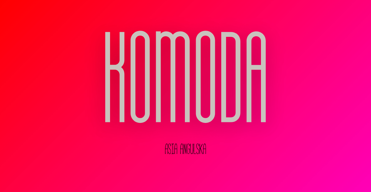
In the world of typography, where every curve and line carries the potential to evoke emotions and convey messages, the Komoda font emerges as a true gem. Designed by the talented Asia Angulska, this font has swiftly gained popularity for its unique attributes and remarkable versatility. With its distinctive narrow minimalist style, Komoda stands as a powerful tool for designers seeking to create captivating logos, headlines, and editorial designs.
One of the most captivating aspects of Komoda font is its ability to effortlessly grab attention. The font’s sleek and minimalist design instantly draws the eye, making it an ideal choice for crafting logos that leave a lasting impression. Whether it’s for a tech startup, a fashion brand, or an innovative product, Komoda’s sleek lines and balanced proportions can help encapsulate the essence of a brand in a single, striking visual element.
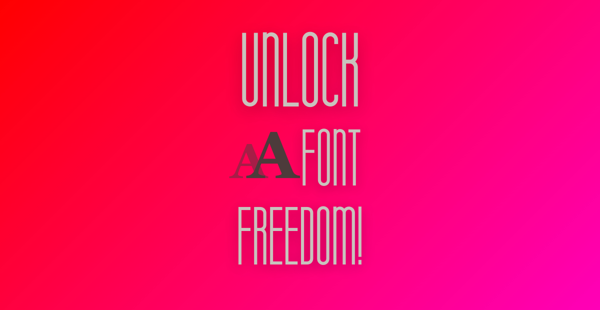
What’s more, Komoda doesn’t stop at logos—it excels in the realm of headlines and editorial design as well. When it comes to editorial projects, choosing the right font can make a significant difference in readability and overall aesthetic. Komoda’s carefully crafted characters maintain excellent legibility, even in smaller sizes. This ensures that your headlines and text remain easily readable, while still adding a touch of elegance that elevates the overall design.
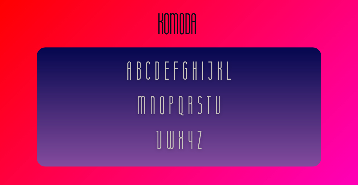
The versatility of Komoda font is further amplified by its inclusion of all caps letters, numbers, symbols, and ligatures. This comprehensive set of characters provides designers with a wide array of creative options, allowing them to experiment and create unique compositions. Whether you’re designing a magazine layout, a website banner, or a social media graphic, the varied elements of Komoda font empower you to tailor your design precisely to your vision.
Imagine a poster that effortlessly blends modern aesthetics with a touch of sophistication. Komoda font can make this vision a reality. Its narrow minimalist design imparts a sense of elegance that sets your poster apart from the ordinary. Whether you’re advertising an event, showcasing an art exhibition, or promoting a new product, the Komoda font’s visual appeal ensures that your message doesn’t go unnoticed.
It’s worth noting that Komoda font comes with a significant advantage—it’s free for commercial use. This means that designers, whether they’re seasoned professionals or enthusiastic amateurs, can incorporate this font into their projects without worrying about licensing fees. This democratization of design resources allows for more creativity to flourish and opens doors for innovative collaborations across various industries.
In conclusion, the Komoda font designed by Asia Angulska is a true testament to the power of typography in visual communication. Its sleek and narrow minimalist style, coupled with its extensive character set, grants designers a world of creative opportunities. From logos that define brands to headlines that demand attention, and from editorial designs that balance readability and elegance to posters that exude modern sophistication—Komoda font effortlessly steps up to the challenge. This font isn’t just a set of characters; it’s a tool that empowers designers to tell their stories with style and impact. So, whether you’re a graphic design enthusiast or a professional seeking a versatile font for your next project, Komoda font is here to help you transform your creative visions into stunning realities.
Leave a Reply