Typography is an essential aspect of design, and every designer knows the importance of choosing the right font to convey their message. But with so many typefaces available, how can designers decide which font is best for their project? A fundamental distinction exists between two popular font families: sans serif vs serif fonts. In this blog post, we will explore the differences between these font families, their characteristics, emotions, and perceptions they evoke, and how to choose the right font for a project.
We will also debunk common myths about sans serif vs serif fonts, discuss the impact of font choice on accessibility and inclusivity, and provide case studies of successful font usage in branding. By the end of this blog post, readers will have a comprehensive understanding of sans serif vs serif fonts and the factors to consider when choosing the right font for their design projects.
- Short Summary
- Exploring the Basics of Serif and Sans Serif Fonts
- Popular Examples of Serif and Sans Serif Fonts
- How to Choose Between Serif and Sans Serif Fonts for Your Project
- Debunking Common Myths About Serif and Sans Serif Fonts
- Combining Serif and Sans Serif Fonts in Design
- Impact of Font Choice on Accessibility and Inclusivity
- Emotions and Perceptions Associated with Serif and Sans Serif Fonts
- Case Studies: Successful Use of Serif and Sans Serif Fonts in Branding
- Tips for Experimenting with Font Pairings and Combinations
- Conclusion and final thoughts 💭
- Frequently Asked Questions
Short Summary
- Serif and sans serif fonts have distinct characteristics, with the former being used in print media and the latter for digital projects.
- Font choice is essential to creating a brand’s personality, as different typefaces evoke various emotions depending on values & desired message.
- Designers can create aesthetically pleasing designs by combining serif & sans serif fonts effectively while considering factors such as usage style & accessibility.
Exploring the Basics of Serif and Sans Serif Fonts
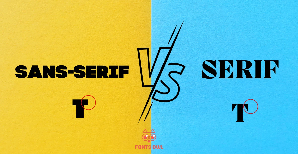
Serif and sans serif fonts are two distinct font families, each with their unique characteristics and history. Serif fonts are characterized by small lines, or “feet,” extending off of the letters. These decorative lines give serif fonts a traditional and classic appearance. On the other hand, sans serif fonts lack these decorative lines, giving them a clean and modern look.
The choice between serif and sans serif fonts greatly depends on the context and desired aesthetic of the project. For instance, serif fonts are widely used in print, such as books, newspapers, and magazines, due to their perceived legibility. Conversely, sans serif fonts have gained popularity in digital projects, where their simplified letterforms enhance readability on screens.
Defining Serif Fonts
Serif fonts are typefaces that include extra strokes, known as serifs, at the end of their letterforms. These typefaces often convey a sense of history, tradition, honesty, and integrity. Serif fonts are popular in print media. Examples of these fonts include Times New Roman, Didot, Bodoni, Georgia and Garamond. The presence of serifs can make the text appear more elegant and formal, which is why many businesses and institutions prefer to use serif fonts to convey reliability and authority.
While serif fonts are often associated with traditional typography, they can also adapt to contemporary designs. By carefully selecting a serif font that reflects your brand’s personality, you can create a unique look that combines both the classic and the modern.
Defining Sans Serif Fonts
Sans serif fonts are typefaces that lack serifs, or lines extending from the edges of letters and alphabets. These fonts feature clean and minimalistic designs, making them a popular choice for modern and contemporary projects. Sans serif fonts are commonly used in design. A few examples are Arial, Helvetica, Futura, and Calibri. The absence of serifs makes these fonts appear more approachable, informal, and accessible, which has led many startups and tech companies to adopt sans serif fonts for their branding.
The term “sans” comes from the French word for “without”, which is fitting, as sans serif fonts are characterized by their simplified letterforms. These fonts first appeared in printed media as early as 1805, and their popularity has only grown since then, with many designers opting for sans serif fonts in both print and digital projects.
Features Of Sans-Serif & Serif Fonts
SANS-SERIF
- Sans serif fonts are characterized by their minimalistic design and thin lines. Because of their simplicity, they are often more legible on screens, making them an optimal choice for headings, small text, and digital projects.
- Another notable feature of sans serif fonts is their low stroke contrast, which means the thickness of the lines in these fonts is more uniform than in serif fonts. The increased legibility of sans serif fonts on screens can be attributed to the inability of screens to accurately render fine serif details in small type.
- Sans serif fonts have become the go-to choice for web and mobile app designers seeking a clean and modern aesthetic.
SERIF
- Serif fonts are characterized by low line contrast, diagonal stress, and small lines or flourishes at the ends of the strokes. These decorative lines, or serifs, give the fonts a traditional and classic appearance. In printed materials, the serifs are believed to guide the reader’s eye along the line of text, improving readability.
- Serif fonts are often associated with a sense of authority, professionalism, and tradition. They are widely used in extended texts, such as books, newspapers, and magazines, where their decorative lines create an authoritative and professional look.
- Serif fonts also suggest the weight of history or experience, making them a popular choice for brands aiming to convey reliability and stability.
Popular Examples of Serif and Sans Serif Fonts
To better understand the characteristics and uses of serif and sans serif fonts, let’s take a look at some popular examples.
SANS-SERIF
- Times New Roman.
- Didot.
- Bodoni.
- Georgia.
- Garamond.
SANS-SERIF
- Arial.
- Helvetica
- Futura
- Calibri.
- Open Sans.
It’s important to note, however, that the choice between serif and sans serif fonts is not always black and white. Designers can be creative and mix and match fonts from both families to achieve unique and eye-catching designs. By carefully considering the context and desired aesthetic of a project, designers can choose the right font to create a memorable and effective design.
Notable Serif Fonts
Times New Roman, Georgia, Garamond, and Caslon are some notable serif fonts that have been widely used in various applications, from print to digital projects. These fonts are often favored for their classic and elegant appearance, making them a popular choice for traditional and formal designs.
Another notable serif font is Didot, which has been used by fashion brand Zara to align itself with iconic premium brands. The choice of Didot in this context demonstrates how serif fonts can be employed to create an aura of luxury and sophistication in branding and design projects.
Notable Sans Serif Fonts
Arial, Helvetica, Futura, and Calibri are popular sans serif fonts known for their clean and modern appearance. These fonts are often employed in digital projects, where their simplified letterforms enhance readability on screens. Their modern and approachable look also makes them an ideal choice for branding and logo design.
Some brands have even commissioned custom sans serif fonts to suit their unique needs. For example, Airbnb created a custom font called Cereal, which was designed to be versatile and adaptive, reflecting the brand’s values and personality. This demonstrates the potential for sans serif fonts to be tailored to specific brands and projects, ensuring a cohesive and memorable design.
How to Choose Between Serif and Sans Serif Fonts for Your Project
Choosing between serif and sans serif fonts for your project ultimately depends on factors such as usage, style, and the emotions and perceptions you want to convey. For example, serif fonts are more common in print projects, while sans serif fonts are often used in digital projects.
However, designers have the flexibility to mix and match fonts from both families to create unique and eye-catching designs that effectively communicate their intended message.
Print vs Digital
Serif fonts are often more suitable for print projects, where their decorative lines can improve readability and convey a sense of tradition and authority. Serif fonts are commonly seen in print projects. Examples of such fonts include Times New Roman, Georgia, and Garamond.
On the other hand, sans serif fonts are generally more applicable for digital projects, where their clean and simple design enhances readability on screens. Arial, Helvetica, and Open Sans are popular sans serif fonts used in digital projects.
When selecting between serif and sans serif fonts, it is essential to consider the platform it will be used on, as well as the atmosphere and formality of the project. By taking these factors into account, designers can choose the right font to effectively convey their intended message and create a memorable design.
Brand Personality
Font choice plays an integral role in communicating a brand’s personality, as different fonts can evoke distinct emotions and feelings. Serif fonts, for example, are often perceived as trustworthy, authoritative, stable, elegant, refined, and formal, making them a popular choice for brands aiming to convey reliability and stability. On the other hand, sans serif fonts are often seen as more approachable, informal, and contemporary, making them an ideal choice for startups and tech companies seeking a youthful and accessible image.
When selecting a font that accurately conveys your brand’s personality, it is important to consider the brand’s values, target audience, and desired message. By carefully choosing a font that reflects these elements, designers can create a unique look and feel for their project that effectively communicates their brand’s identity.
Debunking Common Myths About Serif and Sans Serif Fonts
A common myth about serif and sans serif fonts is that serif fonts are easier to read than sans serif fonts. While it is true that serif fonts are often more legible in print due to the presence of decorative lines, research has shown that there is no significant difference in readability between serif and sans serif fonts.
This debunked myth demonstrates the importance of considering the context and desired aesthetic of a project when choosing a font. Designers should not rely solely on stereotypes and misconceptions about font families, but rather explore various fonts and their characteristics to determine the most effective choice for their specific project.
Combining Serif and Sans Serif Fonts in Design
By combining serif and sans serif fonts in design, designers can create a unique look and feel for their project. One popular approach is to pair a sans serif header typeface with a serif body typeface, providing contrast and visual interest while maintaining legibility.
When experimenting with font pairings and combinations, it is essential to take into account the general aesthetic and legibility of the design, as well as the size, weight, and spacing of the fonts. By carefully considering these factors, designers can create visually engaging and effective designs that effectively combine serif and sans serif fonts.
Impact of Font Choice on Accessibility and Inclusivity
Font choice has a significant impact on accessibility and inclusion in design. For example, sans serif fonts are generally more readable for individuals with low vision, dyslexia, and other impairments. This is due to their clean and simple design, which makes them easier to discern and read for those with visual impairments.
When selecting fonts to ensure accessibility and inclusivity, designers should consider factors such as font size, legibility, height, width, thickness, letter spacing, contrast ratios, and font family. By taking these elements into account, designers can create designs that are not only visually appealing but also accessible and inclusive for a wide range of audiences.
Emotions and Perceptions Associated with Serif and Sans Serif Fonts
The emotions and perceptions associated with serif and sans serif fonts can vary depending on the context and the specific font itself. As previously mentioned, serif fonts are often associated with stability, practicality, maturity, trustworthiness, authority, elegance, refinement, and formality. In contrast, sans serif fonts are often perceived as more approachable and contemporary, making them an ideal choice for modern and informal designs.
It is important for designers to consider the emotions and perceptions they want to evoke when choosing a font for their project. By selecting a font that aligns with the desired emotions and perceptions, designers can create a design that accurately communicates their intended message and resonates with their target audience.
Case Studies: Successful Use of Serif and Sans Serif Fonts in Branding
Various case studies demonstrate the successful utilization of serif and sans serif fonts in branding.
For example, Nike’s use of the Futura font in its logo and branding materials conveys a modern and sleek look, reflecting the brand’s cutting-edge image. Similarly, Honda’s use of the Colt Family and Clarendon Bold typefaces in its branding combines serif and sans serif fonts to create a distinctive and memorable design.
Another interesting example is Airbnb’s commissioned custom font, Cereal, which was designed to be versatile and adaptive, reflecting the brand’s values and personality. The Cereal font showcases the potential for sans serif fonts to be tailored specifically to a brand’s needs, ensuring a cohesive and memorable design that accurately communicates the brand’s identity.
Tips for Experimenting with Font Pairings and Combinations
When experimenting with font pairings and combinations, it is important to consider factors such as the desired aesthetic, legibility, and the emotions and perceptions you want to evoke. One tip for creating successful font pairings is to choose a font that reflects your brand’s personality and values. By selecting a font that aligns with these elements, you can create a cohesive and effective design that communicates your brand’s identity.
Additionally, it is important to think about where and how people will interact with your brand when choosing fonts. For instance, serif fonts may be more suitable for print projects, while sans serif fonts are often used in digital projects. By carefully considering the context in which your fonts will be used, you can create designs that are both visually appealing and accessible to a wide range of audiences.
Conclusion and final thoughts 💭
Throughout this blog post, we have explored the differences between serif and sans serif fonts, their characteristics, popular examples, and how to choose the right font for a project. We have also debunked common myths about serif and sans serif fonts, discussed the impact of font choice on accessibility and inclusion, and provided case studies of successful font usage in branding.
In conclusion, the choice between serif and sans serif fonts ultimately depends on the context, desired aesthetic, and emotions and perceptions you want to convey. By carefully considering these factors and experimenting with font pairings and combinations, designers can create visually engaging and effective designs that effectively communicate their intended message and resonate with their target audience.
Frequently Asked Questions
Answer: For the best readability, serif fonts should be used in print, and sans serif fonts should be used on screen. Times New Roman is a great example of a classic serif font, and Arial is the best example of a sans serif font.
Ultimately, the choice of which typeface to use should depend on the context it is being used for.
Answer: Sans serif fonts are a popular choice for websites because they are easy to read on digital platforms such as computers and phones. They are also seen as being modern and contemporary compared to the more traditional serif fonts, which makes them a great choice for businesses aiming to attract younger audiences.
By using sans serif fonts, businesses can convey an image of being accessible, approachable, and modern.
Answer: Sans serif fonts are ideal for print or digital applications where clarity and readability are key. They are also a great choice for web content, as well as large groups of text on lower DPI (dots per inch) screens like those used in app design.
Additionally, they are simpler to read for children.
Answer: An example of a sans serif font is Arial, which is often used in official documents and webpages due to its clean, sleek look.
Other popular sans serif fonts include Helvetica, Proxima Nova, Futura, and Calibri.
Answer: Overall, sans-serif fonts are more readable and suitable for those with low vision as they offer greater clarity and better text recognition than their serif counterparts.
Sans serif fonts are often used in digital media, such as websites and mobile applications, as they are easier to read on screens. They also tend to be more modern and minimalistic in design, making them a popular choice for many.

Leave a Reply