Imagine this: you’re online or on social media and see a stunning poster with a very stylish font. It immediately catches your eye, and you think to yourself, “Wow, that looks fantastic! I wonder what font that is? I’d love to use it in my own designs.” But alas, you have no idea how to start identifying the font, and the age-old mystery of the unknown typeface begins.
Do not worry, my fellow enthusiasts of typography! We’ve got your back. In this guide, we will show you how to become an expert in identifying fonts. From understanding the anatomy of typefaces to exploring the best tools available, this guide will introduce you to all you need to know in order to crack the code and identify a wide range of mysterious fonts that have been eluding you for so long. Get ready to explore the fascinating realm of typography and discover how to identify different fonts. Grab your magnifying glass and detective hat, and let’s begin!
Introduction to Font
Are you a design enthusiast struggling to find the perfect font for your next project? Worry not, as we’ve got you covered!
In this guide, we will introduce you to the fascinating world of fonts and equip you with the necessary tools to identify them with ease.
Fonts play a critical role in determining the visual appeal of your designs, so having a good working knowledge of various typefaces is essential. By learning about popular fonts and their unique features, you’ll be able to choose the best one for your design projects.
So, let’s dive right in and start exploring the wonderful realm of typography!
What is a Font?
Font is a term that you might have come across while working on documents or designing websites. In simple terms, font refers to the style and size of the text used in any written material. It can make a huge difference in how your content appears and is perceived by people.
Fonts are an essential part of our lives, from newspapers to magazines, books to websites; they are everywhere. The font you choose can help set the tone for your message and evoke different emotions in your audience.
To show seriousness or professionalism, go for a formal font such as Times New Roman. If you want something playful, use Comic Sans instead.
In today’s digital age, fonts have become even more important than ever before. With the rise of social media platforms and online businesses, choosing the right font has become crucial for branding purposes as well.
Why font identification is important?
5 Reasons Why Font Identification is Important
1. Enhances Aesthetic Appeal: Identifying and using the right font can make your designs more attractive, resulting in increased user engagement and better conversion rates for your online projects.
2. Boosts Readability: A suitable font makes the content easier to read and understand, ensuring that users can quickly grasp the information you’re trying to convey.
3. Showcases Brand Identity: Identifiable and unique fonts impart a sense of brand personality, allowing you to create a distinctive visual identity for your company, product or service.
4. Improves Workflow Efficiency: Knowing how to identify fonts quickly and accurately saves time and effort, enabling you to efficiently incorporate them into your projects without unnecessary delays.
5. Elevates Your Typography Skills: Mastering font identification helps you build a comprehensive library of high-quality typefaces, making you more versatile and creative as a designer or content creator.
Understanding font categories:
Are you trying to identify the perfect font for your project? Understanding font categories can be incredibly useful in making that choice. Most fonts can be classified into five basic groups: serif, sans-serif, script, monospaced and decorative. However, some classification systems, like the Vox system, divide them further into 15 styles.
Knowing these categories can help you choose the right font to convey the message and tone you want.
For example, a handwritten script might feel more personal and informal, while a bold, blocky slab-serif might grab attention and convey strength. Remember that each category serves a unique purpose, so take your time to explore your options and find the perfect font for your project.
Serif Font
Serif fonts are highly valued in the design world when it comes to typography. These fonts have decorative strokes at the ends of their letters and have been used since the 15th century. The addition of classic ornaments brings a touch of refinement and heritage to any printed document. Serif fonts are commonly used in books, newspapers, and magazines because they give a classic look and make reading easier.
Some popular serif fonts include Times New Roman, Garamond, Palatino, and Georgia. Each of these fonts has its own unique charm, and the key to choosing the right one for your project lies in understanding their subtle differences.
So, if you’re in the market for a serif font, it’s crucial to factor in key elements like legibility, style, and historical context. This way, you can strike the perfect balance between timeless tradition and a more modern aesthetic for your design.
Sans-serif Font
As a design enthusiast, exploring the world of sans-serif fonts can be an exciting journey. Sans-serif fonts are those that lack the decorative strokes or serifs found in traditional typefaces, giving them a clean and modern look.
Sans-serif fonts are widely used in digital design, including web and graphics, and are also the default typeface in many word processing programs.
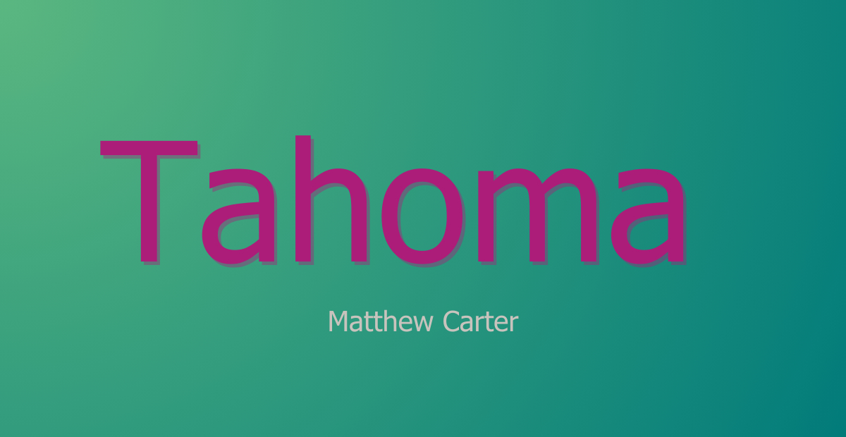
Popular sans-serif fonts like Arial, Helvetica, Verdana, and Gill Sans grace screens worldwide with their sleek, minimalist style. These versatile typefaces are a favorite for creating visual harmony in any project while enhancing readability.
So, dive into the world of sans-serif fonts and elevate your designs with their appealing, contemporary charm.
Script Font
As you explore the world of typography, you’ll inevitably come across script fonts. These charming typefaces are characterized by their fluid, connected strokes that often resemble handwritten or cursive writing. When used correctly, script fonts can add elegance and sophistication to your design projects, making them perfect for delicate invitations, heartfelt greetings, or artistic quotes.
It’s essential to appreciate the nuances of script fonts to make the most of their distinct styles. Whether it’s the elegant flourishes of a formal script or the casual, flowing letters of a brush script, each subcategory offers its own unique charm.
So, don’t be afraid to experiment and find the perfect script font to match your creative vision. Remember, these fonts are usually better for headlines or short phrases than long blocks of text because their complexity might make them harder to read. Now, go ahead and elevate your designs with the graceful artistry of script fonts.
Monospaced Font
Are you searching for a font style that mimics the look of a classic typewriter? Monospaced fonts are the perfect choice for you! These unique fonts have characters that are all the same width, giving your text a clean and uniform appearance.
Monospaced fonts are commonly used for displaying code or technical content. However, they can also be used for body and headline text, creating a nostalgic impression in your documents.
Some popular monospaced fonts you can try are Courier New, Monaco, Lucida Console, Consolas, and Everson Mono. Try using these fonts to give your writing a vintage feel. They add charm, but still make it easy for your readers to read.
Display Font
As a designer, you’ve likely come across display fonts – a fantastic way to enhance your designs and make a significant impact. Crafted to catch the eye, display fonts are specifically designed for headlines, logos, and other attention-grabbing purposes. You can choose from different styles, decorative or playful, to make your design unique and noticeable.
The key with display fonts is to use them sparingly and thoughtfully, as overdoing it may lead to visual clutter and confusion. If you want to make your project look better, try using display fonts. They can add an extra touch to your design and make it look perfect.
Basic Elements To Know About Font
X-height
As a design enthusiast, knowing the characteristics of various fonts is essential to making informed choices. One key aspect to consider is the x-height. The x-height is the height of the lowercase letters in a font. It is the distance between the baseline and the mean line, usually measured using the letter “x”.
Why does this matter, you ask? Well, a font with a larger x-height can improve readability, especially at smaller sizes. On the other hand, a smaller x-height can add elegance and refinement to your design.
So, the next time you find yourself selecting a font, consider the x-height as a vital factor in achieving the perfect look and feel for your project!
Kerning
Kerning is a subtle yet essential aspect of typography that can truly elevate your design projects. In essence, kerning refers to the adjustment of space between individual characters in a word or a line of text. This may sound simple, but achieving the perfect balance can be quite an undertaking.
To start, pay close attention to how different letters and characters interact with one another. Certain combinations, like “AV” or “To,” often require individual adjustments, which can be done using design software such as Adobe Illustrator or Photoshop. Remember, the goal is to create a harmonious and visually pleasing composition that enhances readability.
Ultimately, practicing and refining your kerning skills will greatly enhance the overall impact of your work. So, be patient, stay focused, and watch as your typography prowess reaches new heights.
Weight
Font weight refers to the thickness and heaviness of a typeface. The term is used to describe how bold or light a font appears on a page. It is an essential aspect of typography that can make or break the design of a document, website, or other text-based content.
In typography, fonts are classified into categories based on their weight. These categories include light, regular, bold, black, and extra-bold. Each category has its own unique characteristics that affect readability and overall appearance. In longer texts, it’s common to use lighter fonts for the body and bolder ones for headings and titles. This helps make the text easier to read.
Font weight also plays an important role in conveying emotions and messages through typography. Bold fonts can convey confidence and strength while lighter fonts evoke feelings of delicacy and elegance.
Contrast
Are you familiar with font contrast? If not, don’t worry. Font contrast is a term that describes the difference between two or more fonts used in a design or document. You can make text stand out by using bold and regular versions of the same font. Alternatively, you can mix serif and sans-serif fonts for a more intricate design.
Font contrast is an important factor to consider when creating any type of content because it helps to guide your reader’s eye and improve readability. When you use contrasting fonts effectively, you create visual interest that draws your readers in and makes them want to continue reading.
In order to achieve effective font contrast, there are a few things to keep in mind. First, choose fonts that complement each other rather than clash. Second, use contrasting weights (bold vs thin) or styles (serif vs sans-serif) to create hierarchy within your text.
Tools for Identifying Fonts
5 Handy Tools for Identifying Fonts:
Ever stumbled upon a font you absolutely love but have no idea what it’s called? Your quest to identify it ends here! Check out these top 5 tools to help you find that elusive font:
Fonts Ninja
A browser extension for Chrome and Firefox, which instantly recognizes over 3000 fonts when you hover your mouse over any online text.
Find Website Used Fonts
This Chrome extension scans web pages and displays all the fonts in use along with free download links from Google Fonts.
Type Sample
A bookmarklet tool that reveals font and size details when activated and hovered over online text.
What Font Is
Upload a screenshot or provide the image URL to WhatFontIs website, and it’ll identify the closest match from its vast catalog of 850,000+ fonts.
Font Matcherator
This is the fifth step. Again, edit, remove or duplicate as much as you wish.
Try these font-identifying tools today and end your search for that perfect font!
Conclusion:
In conclusion, identifying fonts is an essential skill for designers and typography enthusiasts. There are many fonts to choose from nowadays, which could make it hard to know them all.
However, there are tools and resources that can help you become a font expert. You can improve your design work and make your brand look better by learning typography terms, using extensions or bookmarklets to find fonts on websites, and using tools to recognize fonts in images.
Explore typography by trying out different fonts and learning how to identify them. This can greatly enhance your design skills, brand, and user experience in the digital world.
By utilizing the helpful tools and resources mentioned above, you will soon become a pro at recognizing and selecting the perfect fonts for your projects. Remember, knowing the language of typography is essential in making informed design decisions.
Keep exploring new typefaces and experimenting with different styles, as this will only enhance your creative abilities. So, stay curious and take your designs to the next level by mastering the art of typography. Happy font hunting!
Leave a Reply