Quick Answer:
Sans-serif fonts are generally used for digital content because they are more legible at smaller sizes and on lower-resolution screens. They are also used for headings and subheadings because they are more attention-grabbing than serif fonts. However, it is important to note that readability is subjective and can vary depending on the context.
In a world where typography plays a crucial role in conveying messages and emotions, sans serif fonts have emerged as a popular choice among designers and brands. Sleek, modern, and highly readable, these fonts have transformed the way we interact with text on various platforms. But when to use sans serif fonts, and how can you make the most of their versatility? Let’s dive into the world of sans serif fonts and explore their applications, advantages, and future.
Short Summary
Understanding Sans Serif Fonts
Sans serif fonts have come a long way since their inception, with a wide range of typefaces and applications across various industries. Characterized by their lack of decorative lines or strokes, sans serif fonts offer a clean and modern appearance that appeals to both designers and consumers alike. From websites to logos, these popular sans serif fonts have become synonymous with a contemporary aesthetic that is both approachable and versatile. One notable sans serif font that has gained popularity in recent years is the sleek and minimalist typeface, Helvetica.
So, what makes sans serif fonts so special, and why should you consider using them in your designs? Let’s delve deeper into the world of sans serif typefaces.
Defining Sans Serif Fonts
At their core, sans serif fonts are defined by the absence of serifs, the small lines or “feet” found on the letters of serif fonts. This lack of embellishment gives sans serif fonts a clean, minimalist look that is both modern and highly readable. In the world of typography, sans serifs have become increasingly popular due to their versatility and adaptability.
Serif fonts, on the other hand, feature these decorative lines, which can add a touch of elegance and sophistication to a design. However, this distinction also impacts the readability of the text, making sans serif fonts a preferred choice for digital platforms and contemporary brands.
Popular Sans Serif Typefaces
There are an abundance of popular sans serif typefaces, popular slab serif typefaces, and roman typefaces that cater to different styles and preferences. Helvetica, Arial, Calibri, and Verdana are just a few examples of widely-used sans serif typefaces, each offering a unique style and personality. These fonts have become a staple in the design world, with their clean lines and versatile nature making them a popular choice for a variety of applications.
Humanist sans serif typefaces, such as Gill Sans and Whitney, are designed to emulate calligraphy, with minimalist contrasting strokes. This category of sans serif fonts is well-suited for small text and is popular in government, education, and finance sectors. In contrast, geometric typefaces, specifically geometric sans serif typefaces, offer a more modern and clean aesthetic, making them a popular choice for various design projects. While humanist serif typeface is not mentioned here, it’s worth noting the differences between humanist and geometric styles in both serif and sans serif typefaces.
Transitional sans serif fonts feature strong strokes and a more uniform look compared to humanist typefaces. They also have characters that are more upright. By understanding the various categories and styles of sans serif typefaces, including transitional serif typefaces, you can select the perfect font for your design needs.
When to Choose Sans Serif Fonts
Sans serif fonts have gained popularity for their versatility and adaptability across various platforms and industries. While their clean and modern appearance is a major draw, there are specific situations where sans serif fonts truly shine. From digital platforms to modern brands and accessible designs, sans serif fonts can elevate your design in ways that other typefaces may not be able to achieve.
Sans serif fonts are perfect for digital platforms, as they are easy to read on screens of all sizes. They also work well for modern brands, as they can help create a sleek look.
Digital Platforms and Web Design
In the realm of digital platforms, such as websites and apps, sans serif fonts have become the go-to choice for designers and developers alike. Their clean appearance and improved readability on screens make them ideal for digital use, ensuring that your content is easily digestible and visually appealing.
The preference for sans-serif fonts on small digital screens in the early days was driven by the need to improve legibility, as resolution was middling and the removal of serifs was necessary for characters to render clearly. Today, with advancements in screen technology and higher resolutions, sans serif fonts continue to dominate the digital landscape due to their inherent readability and approachable nature.
Startups and Modern Brands
Startups and modern brands often opt for sans serif fonts to convey a sense of innovation, approachability, and relevance. These fonts help create a friendly and accessible atmosphere that appeals to a wide audience, making them an ideal choice for companies looking to establish themselves in competitive markets.
Whether it’s a tech firm, a design agency, or a lifestyle brand, sans serif fonts can effectively communicate a brand’s identity and values, setting them apart from the competition with a sans serif logo.
Accessibility and Readability
For designs that prioritize accessibility and readability, sans serif fonts are a natural choice. Their straightforward design and improved legibility make them an optimal selection for content targeting children or individuals with reading difficulties. Sans serif fonts are also ideal for use in accessible designs, as their uncomplicated nature ensures that the text remains clear and easy to read on various devices and platforms.
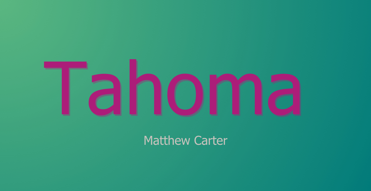
Some of the most accessible sans serif fonts include Arial, Verdana, Tahoma, Helvetica, Calibri, and Century Gothic. By incorporating these fonts into your designs, you can ensure that your content is inclusive and user-friendly, catering to a diverse audience with varying needs and preferences.
Mixing Serif and Sans Serif Fonts
While both serif and sans serif fonts have their unique strengths and applications, mixing the two can create visual interest and enhance readability when done correctly. By combining the elegance and sophistication of serif fonts with the approachable and modern nature of sans serif fonts, you can strike a perfect balance and elevate your designs to new heights.
Using a combination of both serif and sans serif fonts can be a great way to create a visually appealing and easy to read design. With careful consideration and a keen eye for detail, you can create a design that is both aesthetically pleasing and aesthetically pleasing.
Pairing Guidelines
When it comes to pairing serif and sans serif fonts, there are a few key guidelines to keep in mind. First and foremost, consider the contrast between the two typefaces. A strong contrast in weight, style, or character can help establish a clear hierarchy within the design, ensuring that your text remains organized and visually appealing.
In addition to contrast, assigning distinct roles to each font is crucial for a successful pairing. Typically, one font should be designated for headings, while the other is used for body text. This clear division of roles helps create a coherent and balanced design that is easy to read and navigate.
By following these guidelines, you can confidently pair serif and sans serif fonts, crafting unique and engaging designs that stand out from the crowd.
Examples of Successful Font Pairings
There are countless examples of successful font pairings that showcase the power of mixing serif and sans serif fonts. Some popular pairings include Times New Roman and Arial, Georgia and Helvetica, and Baskerville and Open Sans. Each of these pairings expertly combines the distinct characteristics of both serif and sans serif fonts, resulting in visually appealing and highly readable designs.
By experimenting with different combinations and adhering to the pairing guidelines discussed earlier, you can create your own striking font pairings that elevate your designs and capture your audience’s attention.
Customizing Sans Serif Fonts
While there are countless sans serif fonts available to choose from, customizing these fonts can offer a unique and tailored design that aligns with a brand’s identity. By modifying existing typefaces or developing custom fonts, you can create a truly distinctive and recognizable typeface that reflects your brand’s values and personality.
This can be a great way to make your text stand out and be more memorable. It also helps to create a consistent look and feel across all of your content, making it easier for readers to recognize your brand.
Modifying Existing Typefaces
One way to customize sans serif fonts is by modifying existing typefaces. This can involve adjusting the weight, width, or other characteristics of the font to create a customized appearance tailored to your specific needs. Modifying existing typefaces can be done using software such as Adobe Illustrator or FontLab, which allows you to edit glyphs, add variations, and manipulate anchor points for a truly customized look.
By modifying existing typefaces, you can create a unique and personalized design that sets your brand apart from the competition. This level of customization ensures that your brand’s typography remains consistent and recognizable across various platforms and applications.
Developing Custom Fonts
Another approach to customizing sans serif fonts is by developing custom fonts from scratch. This process allows for complete control over the design, ensuring that the final product is a perfect reflection of your brand’s identity and values. Creating custom fonts can be a time-consuming process, often taking several months to complete. However, the end result is a truly unique and recognizable typeface that sets your brand apart.
To create custom fonts, you can start by drawing the letterforms by hand or using vector-based software such as Adobe Illustrator. Once the letterforms are designed, specialized font creation software like FontLab, Glyphs, or FontForge can be utilized to refine and finalize the font.
By developing a custom font, you can create a cohesive and consistent brand identity that resonates with your audience and stands out in the market.
The Future of Sans Serif Fonts
As design trends and technologies continue to evolve, the future of sans serif fonts will likely involve further adaptability and innovation. With a focus on variable fonts, optical sizes, and emerging technologies, sans serif fonts will continue to transform and adapt to new mediums and user experiences.
These changes will allow designers to create more dynamic and engaging experiences for their users, while also providing a more consistent and unified look across different platforms. As technology continues to evolve, sans serif fonts will become even more popular.
Variable Fonts and Optical Sizes
Variable fonts and optical sizes are two developments that promise to revolutionize the world of typography. Variable fonts allow for seamless adjustments to weight, width, and other characteristics, providing designers with unparalleled control and flexibility in their designs. Examples of variable fonts include Inter, Source Sans Pro, and Roboto, which showcase the potential of this technology in creating dynamic and adaptable designs.
Optical sizes, on the other hand, are fonts that are specifically designed to be used at different sizes, such as small, medium, and large. This unique feature ensures that your text remains legible and visually appealing at any size, providing an optimal user experience across various devices and platforms.
By embracing these advancements, designers can create more versatile and adaptable designs that cater to a diverse range of needs and preferences.
Emerging Technologies and Mediums
In addition to variable fonts and optical sizes, emerging technologies such as virtual reality and animations will likely play a significant role in the development and use of sans serif fonts. As designers adapt to these new mediums and user experiences, sans serif fonts will continue to evolve and transform, offering even greater flexibility and adaptability in the world of typography.
By staying ahead of these trends and embracing new technologies, you can ensure that your designs remain cutting-edge and relevant in the ever-changing landscape of design.
Summary 💭
Sans serif fonts have undoubtedly made a significant impact on the world of typography, offering a clean and modern aesthetic that appeals to designers and consumers alike. From digital platforms and modern brands to accessibility and readability, sans serif fonts have proven to be versatile and adaptable across various applications. As the future of typography continues to evolve, embracing advancements such as variable fonts, optical sizes, and emerging technologies will ensure that your designs remain fresh and relevant in an ever-changing landscape. So go ahead, explore the world of sans serif fonts, and discover the endless possibilities that await you in the realm of typography.
Frequently Asked Questions
Answer: When using a sans serif font, consider using them for websites and apps, large display signage, areas with limited space for copy such as signs and maps, and on lower DPI (dots per inch) screens.
Additionally, they are often easier for children to read because of their simpler appearance.
Answer: Sans serif fonts are often chosen for their modern, clean appearance and legibility. They have a simplified, minimalistic aesthetic that makes them appear more modern and contemporary.
Sans serif fonts can help add an element of sophistication to a design, while also being easier to read at small sizes or from a distance. Therefore, they are preferred for use in digital applications and displays.
Answer: Arial is an example of a sans serif font.
The classic sans serif typeface is Futura. The timeless font, Times New Roman, is a serif typeface. Helvetica is a popular sans serif typeface.
Answer: In general, serif fonts are typically used in print design for headings, body text, and captions, while sans serif fonts are most commonly used on the web.
However, this is not a hard-and-fast rule; both font types can be used in either format, depending on the desired aesthetic and tone.
Answer: The key difference between serif and sans serif fonts lies in the presence (serif) or absence (sans serif) of small lines or “feet” on the letters. Serifs add a more traditional, classic look while sans serifs create a modern, simple appearance.


Leave a Reply